The Premier Lacrosse League Championship Series begins on July 25th, 2020, and promotion for this adjusted format has brought new jerseys along with it. The new Waterdogs LC had to premier their first set of kits before this season, and all original six followed suit with their own new versions of home and away.
The Stringers Society Crew and our two guest judges, @CardinalLacrosse & @WashedUpLaxBros, independently voted to create an unbiased ranking of all seven uniform sets. While many of the jerseys are presently sold-out from the PLL Shop, expect many restocks once the Championship Series comes around. The PLL has had no shortage of available apparel in its short history, and they won’t let the opportunity to supply their fans with jerseys fall out of their hands.
The Best Premier Lacrosse League Jerseys
Instead of teasing you and making you scroll all the way to the bottom, or click through a whole slideshow, here are the unbiased results of our vote. Our blind vote was based on a point system that awards seven points to first place and only one to last place. The results of the voting are below:
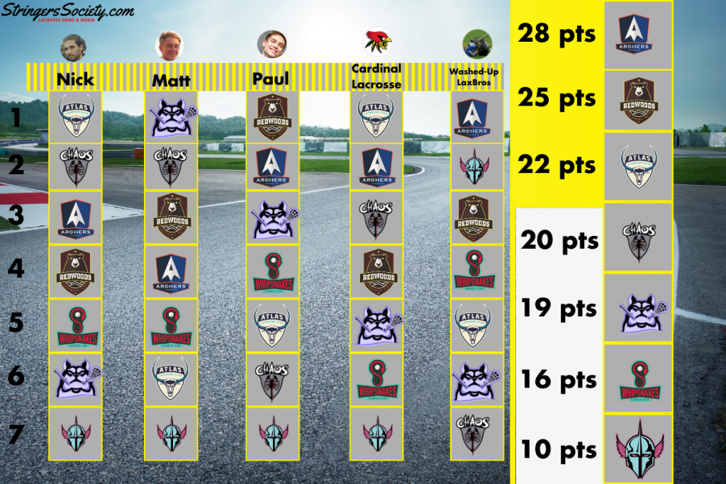
Best PLL Jerseys
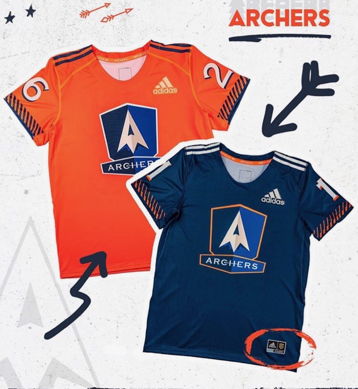
“The orange is a nice change of pace for the Archers, and I’m a fan of the simplicity; but getting rid of the blue instead of the white kit would’ve put this at #1 for me. Not enough going on to beat the Chaos or Atlas in my mind.” – Nick
“The Archer’s colorway just has a clean feel to it, but there’s not enough for me. They could’ve done something to jazz it up a little bit, and I’d like it a lot more. Really just a plain design.” – Matt
“The orange really sold it for me with the Archers jerseys, and I can’t hate how they have the best number font in the league either. Clean and classic” – Paul
“Archers were the best dressed team in the league last year, and I had a ton of hope for the tweaks that might be coming down the line. Unfortunately, I found myself disappointed in losing the perfect white kits and oversimplifying what was already a fairly simple design. They still have a great color scheme that can be work in any combination.” – Cardinal Lacrosse
“I’m biased because I love the show ‘Archer’ and its well written comedy, but the clean and simple uniforms here convey a clear point. What’s not to love? The “our light uniform is actually a dark uniform” thing will get them called out at pick-up games, but they’re fine for now. I’m also salty because they got rid of those SUPER clean whites that went perfect with blue shorts.” – Washed Up Lax Bros
2nd Best PLL Jerseys
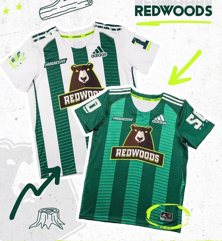
“If the Redwoods didn’t have so much shiny foil on their numbers, this would be a much better kit. I can’t hate the attempt to get an “Oregon-esque” highlighter scheme going, but this is entering a dangerous territory of ugly that lacrosse has been in before.” – Nick
“The white Redwoods jersey is a huge improvement from last year’s, and the green on green is a nice match. I gotta give it to the Redwoods, because I wasn’t a huge fan of their previous look.”- Matt
“The Redwoods jerseys have that clean and strong look that the PLL needs to give to each team. I had to put them at the top of my board. Everything is balanced and looks extremely professional.”- Paul
“Eliminating the goof white and maroon uniform was one step forward, but making the trees into stripes was two steps back. There’s nothing “wrong” here, but it lacks personality. Hopefully the helmet, or a green and white combo, can save things for the Redwoods.” – Cardinal Lacrosse
“Great to see a team in the PLL labeling themselves as the “Progressive” team, even if it is just a brand sponsor. In general, I really like the stripes that are slimming and appear to be a natural evolution from the last season. I do miss the “red” color, but they may be phasing that out.” – Washed Up Lax Bros
3rd Best PLL Jersey
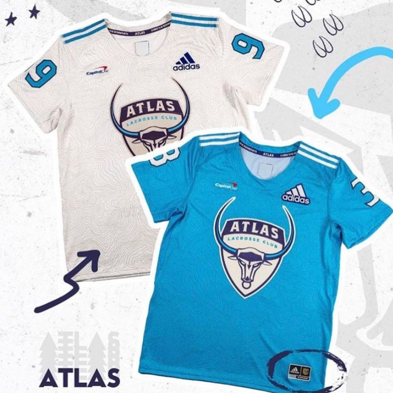
“The topographical map is just a great background to the team with a pun that doesn’t hit you too hard over the head. Chef’s kiss humor with a clean colorway on both sides.” – Nick
“It’s not all bad, but I don’t have a lot to like either. The white Atlas jerseys have a weird greyish look with the design, and that puts them really low on my list. “- Matt
“Off-brand Hopkins is just ok if you ask me. Can’t be mad about it, but I’m not happy either.”- Paul
“Atlas was already among the best uniforms in the league last year, so it wasn’t surprising at all to see them come back this year with almost no changes. The new league patches are great and the addition of the “pride tag” in the collar is a great touch. From top to bottom no one in the league has a better set-up than Atlas. They can wear any combination of gear and it would still look great.” – Cardinal Lacrosse
“Was nice of them to include a topographical map to really remind the players and the audience how far they’ve got to go as a team to make up. I mean they did manage to find some steam later in the season but a 25-7 Lesson from the Archers? For that type of lesson you usually earn college credit. Huge fan of their light blue, but mostly because that’s the colors I played in in college.” – Washed Up Lax Bros
4th Best PLL Jersey
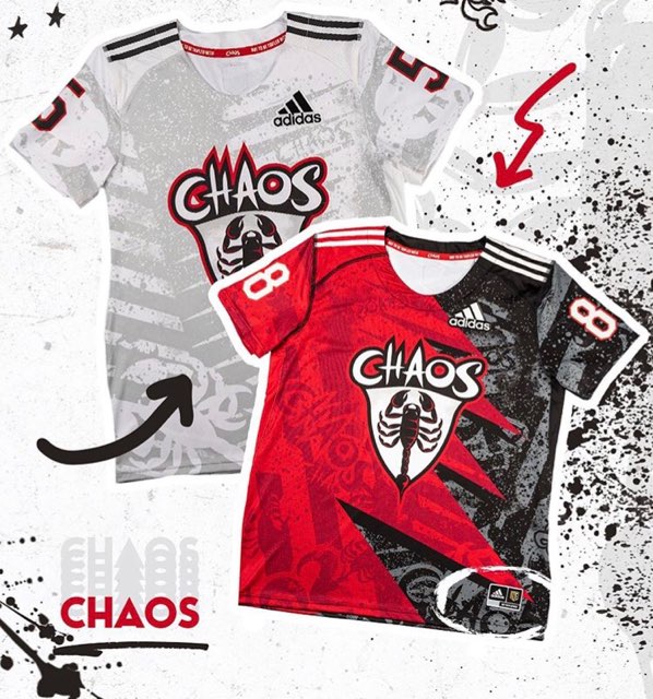
“My only gripe with the Chaos jerseys is that they both say “Chaos” in the background pattern multiple times. If we just had the chaotic pattern, these could have maybe passed the Atlas for me.”- Nick
“The Chaos took a big risk, and I think it paid off for them. This design is definitely going to get a lot of attention on the field, but it’s a lot of fun and really goes with their brand.”- Matt
“I was NOT feeling these ones from the Chaos. They look like something Affliction would’ve draped on a fighter on their way to the octagon in ’03.”- Paul
“Love them or hate them, Chaos finally embraced their own moniker; moving from an organized and geometric pattern to a wild and crazy “ghosted” design and a red and black split jersey. The white is great. Giant logo across the chest aside, I don’t think I would change anything. The black and red isn’t for everyone. Is it tacky, yes. Could it have been toned down a touch and still met the same goals, most likely. But will you forget this uniform, not likely. I love the attempt to create something memorable.”- Cardinal Lacrosse
“So the “rejected concept art from Suicide Squad/Birds of Prey” angle was a BOLD strategy. But I can see how getting knocked out of the playoffs the Whipsnakes (who wear red) and the Redwoods (who have red in their name) would make you really want to sit down, reassess, and really think hard about including the color red in your uniforms for the new season.” – Washed Up Lax Bros
5th Best PLL Jersey
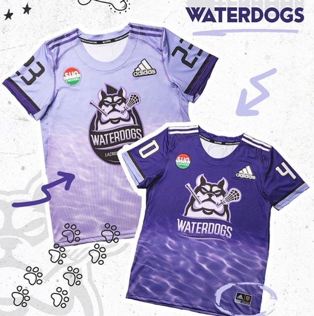
“Different logos? Sponsor that sticks out like a sore thumb? Black in all the wrong places? The only positives for me are the lack of shiny tape and the fact that the waves pattern actually looks like water.”- Nick
“The Waterdogs put the best jersey out there; plain and simple. The water effect goes with the color scheme, and it’s a huge hit. They really made a…splash with these jerseys.”- Matt
“I’m excited to see these kits running around during the Championship Series. The Waterdogs put a jersey out there that’s going to be turning some heads for a long time.”- Paul
“This may come as a surprise to those of you that follow me, but much like the Chaos, I appreciate that the Waterdogs tried to create a uniform that no one else in the PLL was wearing. I would rather you die trying something than take the simple boring approach. That being said, the color shift in the light purple jersey and the lack of black shorts has me miffed. The Waterdogs have such a great color palette but it feels like they could have used it a bit better.”- Cardinal Lacrosse
“Was nice of them to remind the people in the stands that ‘water’ is a core motif. The lavender is actually really nice though, looking forward to how it works with helmets and shorts.”- Washed Up Lax Bros
6th Best PLL Jersey
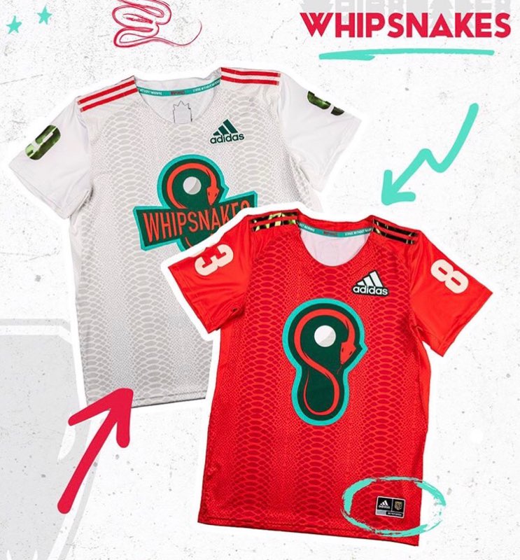
“These uniforms are a hypnotic mess. My eyes cross when I look at them too closely, and that shiny taping is just not what we need in lacrosse. Tin foil belongs on leftovers and conspiracy theorists, not lacrosse jerseys.”- Nick
“The most average jersey if you ask me. I can’t get too mad at the Champs, but I’d have gone a different route with the design. Can’t really make heads or tails of it.”- Paul
“Why are there 3 snake “bellies” on the jersey? It doesn’t make sense. Otherwise, these jerseys are really kinda boring. Boring font. Boring use of color. At least this year they won’t have the bow-tie tramp-stamp logo. The whips have 5 official colors according to their brand guide. So why are we only using 3 and always so sparingly. These uniforms should really be so much better. But hey, at least they have decent helmets.”- Cardinal Lacrosse
“There’s no crown on this one! How will we remember they’re the defending champions?! The snakeskin motif is chill, doesn’t look that much like tire tracks which is good, but if these boys don’t come out in some snakeskin cleats I swear to God I’ll write a strongly worded yelp review.”- Washed Up Lax Bros
Worst Jersey
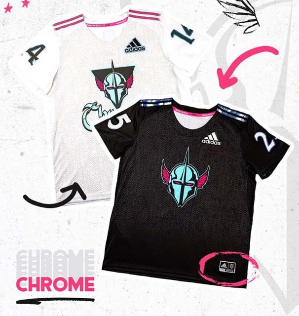
“Chrome really decided to double down on being the worst uniform in the league two years running. Saddest thing is that adding the “chrome” taping doesn’t actually help.”- Nick
“The Chrome didn’t bring anything special to the table. We saw it before and we’re impressed. It’s really just alright at best.”- Matt
“No comment at this time on the Chrome jerseys. Please respect my wishes.”- Paul
“This team should have the “coolest” uniforms in the league with that color scheme. Instead, they have the most boring and overly simplified uniforms. The black jersey is using an iridescent tape to outline the numbers and create the names. It looks like something for an All-Star game and not a professional team; the names will be nearly impossible to see. The sleeves don’t continue the chain-mail pattern from the body of the jersey, which gives both jerseys the look of a vest. Combine that with the invisible wings helmet and you have the makings of the worst uniform set-up in the league.”- Cardinal Lacrosse
“Honestly these are really solid and no major criticisms. Didn’t hate their jerseys last season, but did think they needed to decide if they were going to go with the Knight theme on the dark unis or the Tron theme on white. The chain-mail motif on these new ones are actually really tight.”- Washed Up Lax Bros

